The thumbnail sketch I’d created got me really excited about the direction the project was going but it also brought into focus a quality to this image that made it distinctly different from anything else I’ve ever worked on.
The primary thing the thumbnail reminded me of were the “prison” etchings created by Giovanni Battista Piranesi, architectural fantasies where the figures were dwarfed by the spaces they were in (if there were even figures included at all.) I’ve spent most of my illustration career drawing figures, with the surrounding space being nothing more than the setting for them. The stars of the show were the figures and the background was just that: background.
With this image, the background was going to be the star and the figures were going to be relegated to a supporting role, primarily there to give a reference for the scale of the spaces as well as indicating what direction their particular world was facing ( a consideration that never has to be made in a conventional image.) I’ve been continually surprised by how challenging that conceptual turning-inside-out has been for me to deal with as I go through this project.
With the primacy of the space in mind, I started going about hammering out the overall architecture. I’d already established that I wanted the final image to be done in Adobe Illustrator, very clean-edged and graphic, possibly with a limited palette that would make each of the 3 worlds distinct. One of the benefits that I immediately experienced as I got to work was being forced to become thoroughly familiar with Illustrator’s perspective grid. I’d occasionally used it in previous illustration assignments whenever I needed any “quick and dirty” perspective work, but anything that got too 3D was easier done in Blender, a program I’ve come to love in the 5+ years I’ve been using it. By comparison, Illustrator’s 3D tools can be relatively clunky, but the more I got to know them, the more enjoyable using them came to be and the more possibilities they opened up. Because they aren’t trying to accurately reproduce real world physics (as Blender tries to do) the kind of shapes that come out of Illustrator’s 3D tools are more graphic, emphasizing line rather than volume, which was more in keeping with the kind of look I wanted the finished image to have.
My plan at this stage was to create a basic structure in Illustrator, which I could then use to place reference figures in the correct perspective after importing it into Blender. I wasn’t thinking in terms of color yet—it was all about getting a clear structure in linear perspective to use as a scaffolding to hang everything else on.
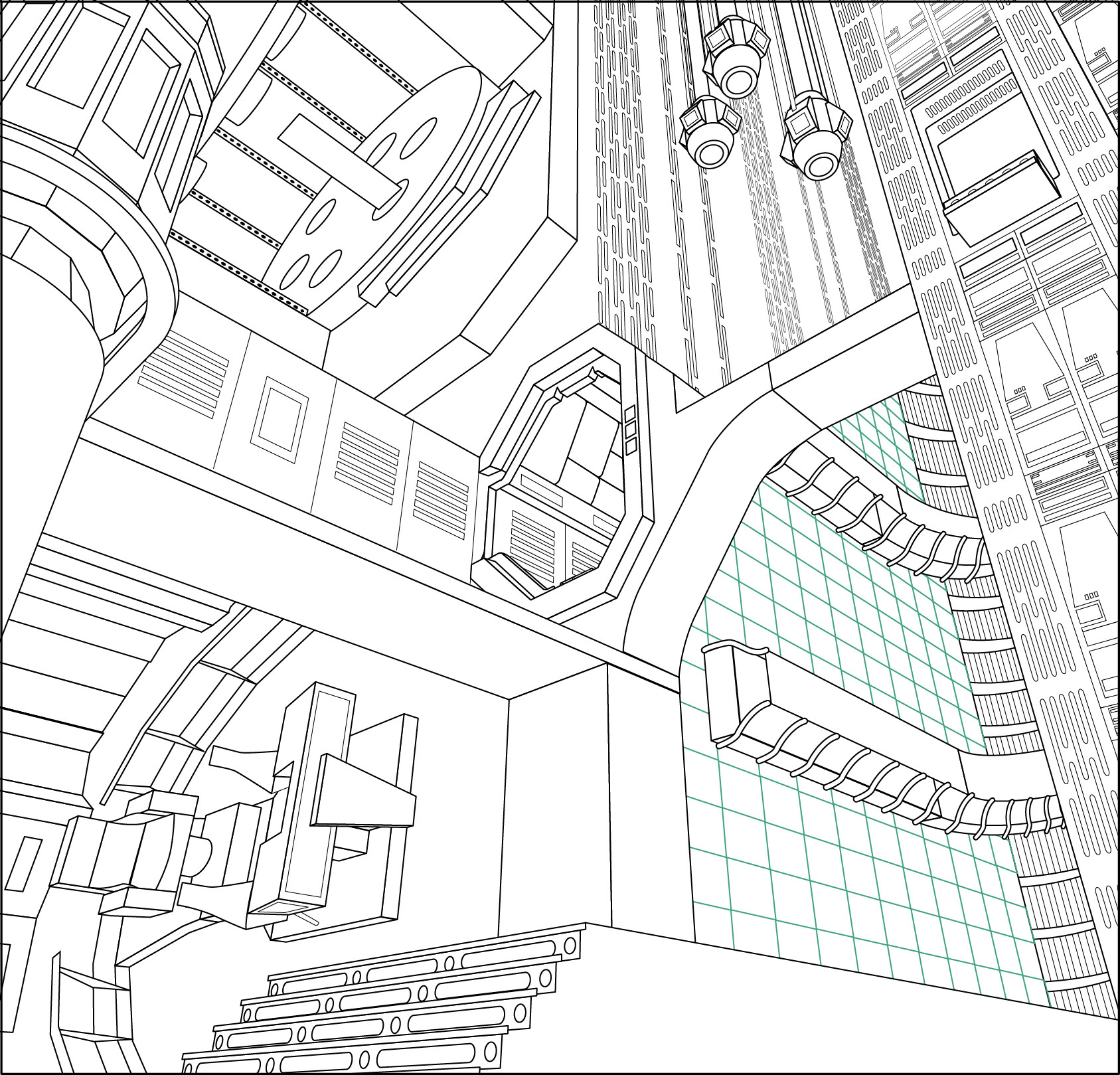
The lower right quadrant of the image was going to be the egg chamber from Alien and there was really no way I was going to be able to "rough in" the kind of alien architecture Giger created for that space, so I just added a floor grid for the time being, to give myself a clear idea of the depth of the space, so I could "Giger it up" later on. I added a reference rectangle in the upper left corner Transporter Room from Star Trek, to give myself an idea of the relative size the figures were going to be. The great thing about Illustrator's perspective grid was that I could slide that rectangle around in 3D space so I could see what size a figure would be at any place in the image.
The next step was going to be filling it all in with some local color to see if each space I’d chosen to include in the image worked well with all the others.